Norm 1

.png)

.png)
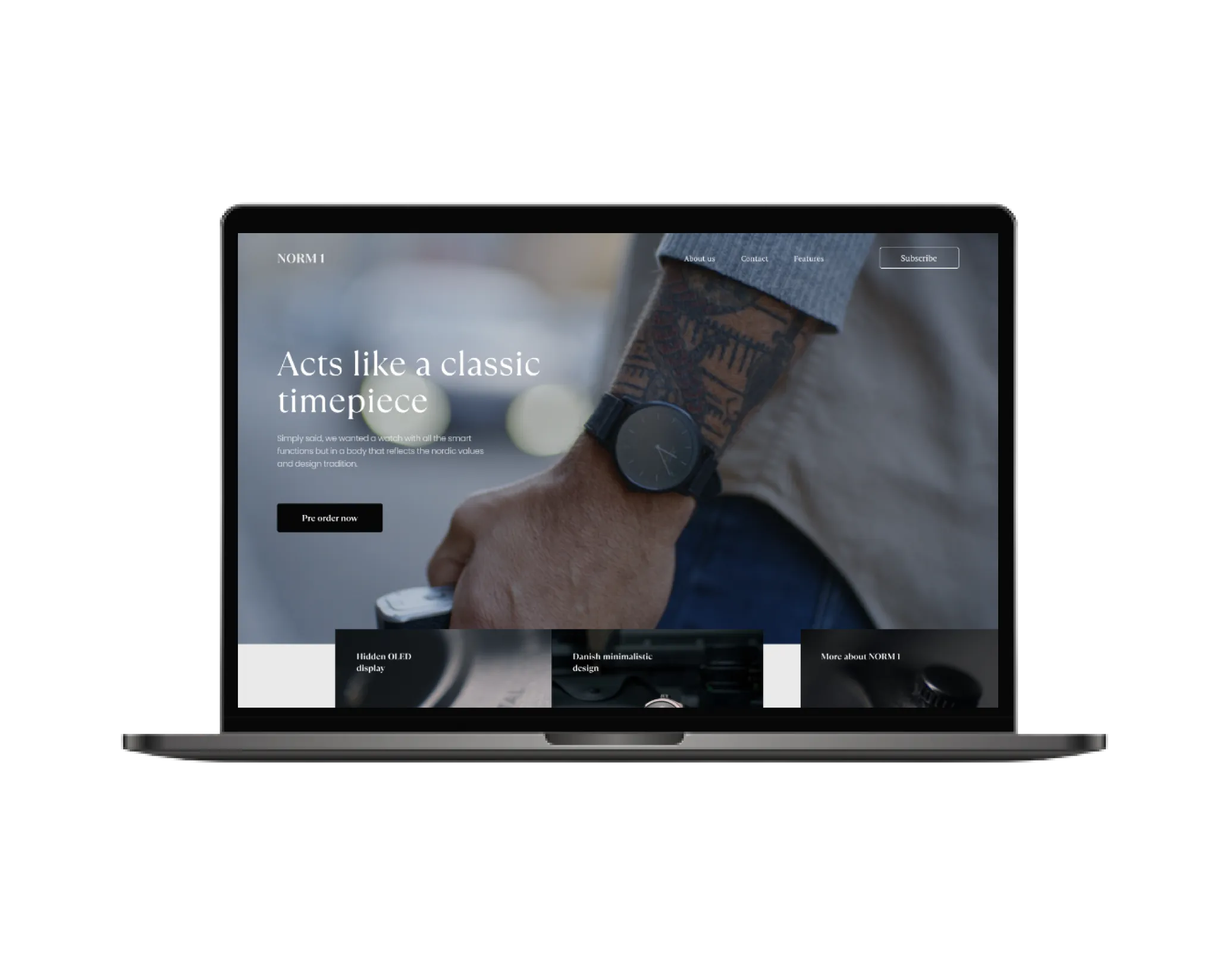
The NORM 1 is take on a modern and classic timepiece. Most people wonder why smart watches are mostly reserved for sports and technology enthusiasts. The creators wanted to make a smartwatch for everyone with a stunning design and beautiful materials. Simply said, they wanted a watch with all the smart functions but in a body that reflects the nordic values and design tradition. Stunning feature packed minimalistic smartwatch, with hidden OLED dispaly, as well as combine functionality and style like never before. It's all about NORM 1.
The first phase of this project was to analyze the information on the kickstarter to determine the brand voice. The second phase of this project was to find the appropriate shapes, fonts, and colors to convey the brand feel and bring it to the product web page.


One of the features of developing a landing page for a physical product is to place it in the most visible place, preferably already in the process of use.It is also important to let the user know right away where he got and why he needs this page.Don't forget about the main features that distinguish the product from the competition. Add a couple of call to action, the main thing here is not to go overboard. To further engage the user, you can use the video. As a result, close the objections to the FAQ and reviews. This is a classic structure of the landing page.

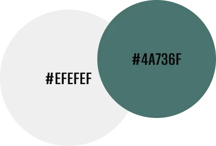
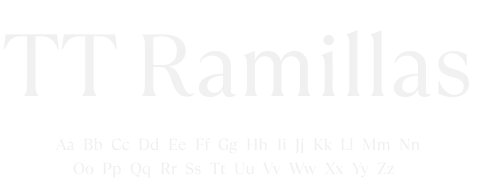
Shapes, fonts and colors must match the product. In this project, a modern and stylish serif font was used to emphasize the combination of classics and technology in the product. The shapes of the elements are also quite strict and straightforward. The union of classics and technology is also reflected in the color. The main color is a shade of white, itself neutral. It is complemented by a contrasting shade of green, which evokes a sense of technology and environmental friendliness of the product. The elements on the page are spaciously enough, using a minimal amount of graphic elements to focus attention on the product.


Mobile version of the site in progress. You can go to the desktop version